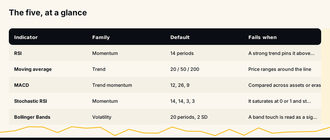
The five technical analysis indicators almost every chart starts with are the Relative Strength Index, moving averages, MACD, the Stochastic RSI and Bollinger Bands. Between them they cover three questions: is there a trend, how fast is price moving, and how wide is the range it is moving in. Each answers its own question well and every other question badly.
That last part is what most introductions leave out, so this one is organised around it: for each of the five, what it computes, which settings change the answer, and the conditions in which it will mislead you.
What an indicator is, and what it can never be
An indicator is an arithmetic transformation of past prices — and, in a few cases, past volume. Nothing more. Every value you see was computed from bars that have already closed, which means no indicator contains information the market did not already have.
What they are good for is compression. A 200-bar chart holds more detail than anyone can weigh by eye, and an indicator collapses one aspect of it into a number comparable across time and across assets. The cost is everything it threw away, and knowing what a formula throws away is most of the skill.
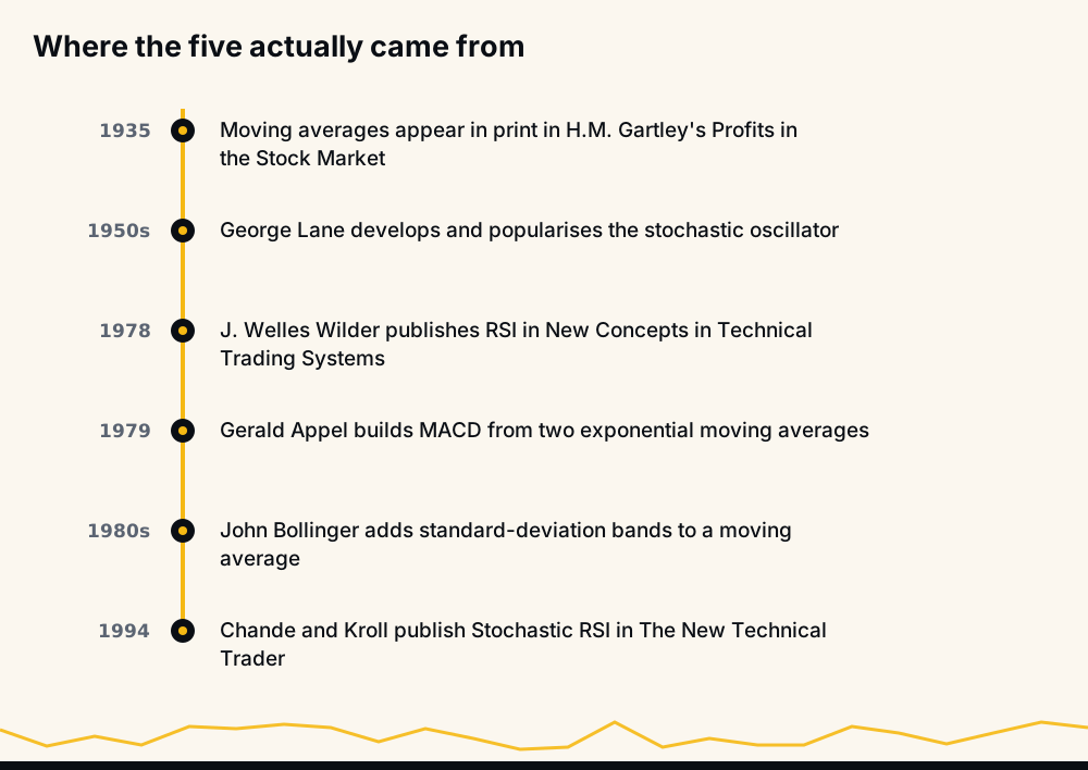
Four of the five also predate electronic markets. They were designed to be computed by hand, on daily bars, in markets that closed every night. Crypto trades continuously, and that mismatch shows up in ways noted below.
1. Relative Strength Index (RSI)
RSI compares the size of recent gains to the size of recent losses and maps the ratio onto a 0-100 scale. Welles Wilder published it in 1978, and the formula is RSI = 100 − 100 / (1 + RS), where RS is the average gain divided by the average loss over the lookback.
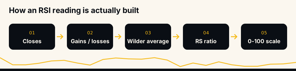
The averaging is the part worth understanding. Wilder did not use a plain mean — each new average is (previous average × 13 + today's value) ÷ 14. That is exponential smoothing, so an RSI(14) never fully forgets the fifteenth bar back. The "14" is a decay rate, not a window, which is why two platforms seeded from different start dates show slightly different RSI on the same candle.
Settings that matter. The lookback sets the horizon: RSI(2) is a mean-reversion tool that lives at the extremes, RSI(14) is the standard swing setting, RSI(21) is smoother and slower. Moving between 13 and 15 is fitting noise; moving between 2 and 21 changes what the indicator is for.
Where it fails. An RSI above 70 does not mean expensive; it means recent buying has overwhelmed recent selling, which is the definition of a strong uptrend. In a real trend RSI holds above 70 for weeks, and every "overbought" sell taken on that basis is a short against momentum.
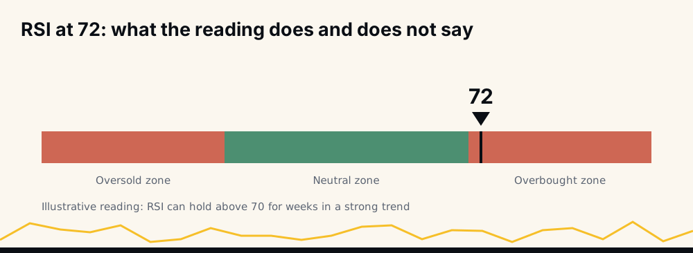
The more useful reading, popularised by Constance Brown, is that the effective range shifts with the regime. In a bull market RSI tends to floor near 40-50 rather than 30; in a bear market it stalls near 55-65 rather than 70. Those shifted levels act like support and resistance, and carry more information than the fixed 70/30 lines.
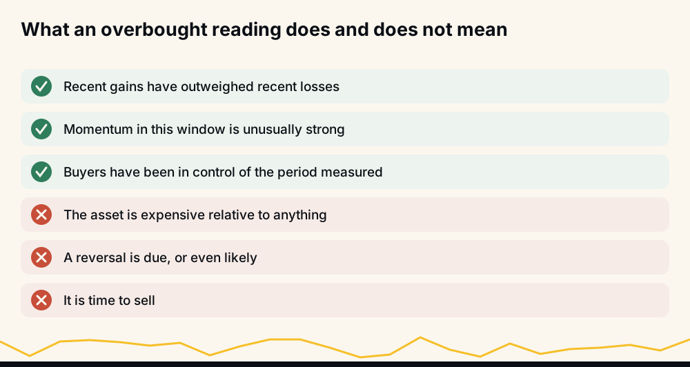
The second failure is divergence. A bearish divergence — price making a higher high while RSI makes a lower one — can repeat three or four times inside one parabolic advance before anything turns. Divergence describes decelerating momentum, a normal feature of a maturing trend, not a dated reversal.
2. Moving averages: SMA and EMA
A simple moving average is the mean of the last N closes. An exponential moving average weights recent closes more heavily, with a smoothing factor of 2 ÷ (N + 1).
The lag is measurable rather than vague. The centre of mass of an N-period SMA sits (N − 1) ÷ 2 periods behind the present, so a 200-day average is describing conditions around 100 days ago.
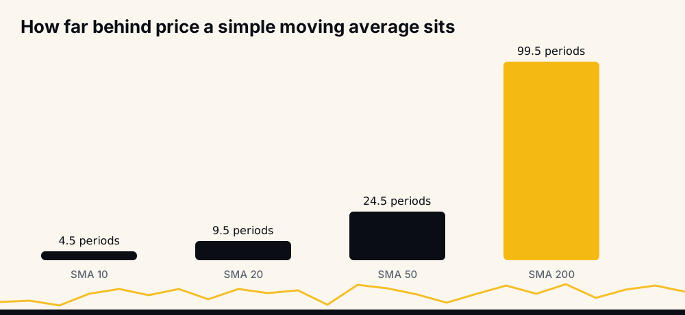
A detail that surprises people: an EMA with the same N has the same average lag. It reacts faster to a sudden move because it front-loads the weights, but it does not see further ahead — it trades smoothness for responsiveness, and pays with more false turns.
Settings that matter. The period should match how long you intend to hold; a day trader reading a 200-day average is reading someone else's timeframe. The popular 20 / 50 / 200 set is convention, not mathematics — nothing about the 200-day line is special except how many people watch it.
Where it fails. In a range. A crossover system — the 50 crossing above the 200 is a golden cross, below it a death cross — needs a sustained trend to pay for its whipsaws. When price oscillates around the average the lines cross repeatedly, each cross a small loss. Such systems make their money in a handful of long moves and give it back steadily in between.
The 24/7 problem is specific to crypto. A "daily close" on a market that never closes is just a chosen hour, and a chart set to a different session boundary produces a genuinely different 200-day SMA. If the average is a decision point, know which UTC cut-off it uses.
3. Moving Average Convergence Divergence (MACD)
MACD measures the gap between two exponential averages. The MACD line is EMA(12) − EMA(26); the signal line is a 9-period EMA of the MACD line; the histogram is the distance between the two. It is a trend indicator differentiated once — a measure of how quickly the trend itself is changing.
Two events get confused constantly. A zero-line cross means the fast and slow averages have crossed — a change in trend direction. A signal-line cross means momentum has turned relative to its own recent average — a change in the rate of change. The histogram flipping sign is the same event as a signal-line cross, not an extra confirmation.
Settings that matter. 12, 26 and 9 come from a six-day trading week in the late 1970s. The only setting worth changing is the pair of periods, matched to your holding time. Full mechanics are in the MACD indicator explained walkthrough.
Where it fails. MACD is unbounded and denominated in price units, so its values cannot be compared across assets or eras. A reading of 400 on a five-figure asset and 0.002 on a sub-cent one describe nothing in common, and the same asset after a ten-fold advance produces MACD values ten times larger for identical percentage moves. For comparability, the percentage price oscillator expresses the same gap as a percentage of the slow average.
Its other weakness is the one every lagging tool shares: in a sideways market the two lines braid together and produce a crossover every few bars, each one a signal that goes nowhere.
4. Stochastic RSI
Stochastic RSI, published by Tushar Chande and Stanley Kroll in 1994, applies the stochastic oscillator formula to RSI values instead of to price: (RSI − lowest RSI in N) ÷ (highest RSI in N − lowest RSI in N). Most platforms then smooth the result with a 3-period average, and again for a signal line.
It is an indicator of an indicator, two transformations from any actual price, answering one narrow question: where does RSI sit within its own recent range?
Settings that matter. The usual 14, 14, 3, 3 means a 14-period RSI, a 14-period stochastic range and two 3-period smoothings. Remove the smoothing and it is unreadable; extend it and it becomes a slower copy of RSI.
Where it fails. Saturation, structurally rather than occasionally. Whenever RSI prints a new high for the lookback, numerator equals denominator and StochRSI is pinned at 1 by construction. In any decent trend it sits at the top of its range continuously, so "overbought" stops carrying information exactly when you want it most.
The consequence is a far higher false-signal rate than RSI itself. Chande and Kroll built it to make RSI more sensitive, and sensitivity trades against reliability. Used at extremes with a trend filter it is a reasonable timing aid; used alone it fires constantly.
5. Bollinger Bands
John Bollinger's bands are a 20-period simple moving average with an upper and lower band placed two standard deviations away, where the deviation is computed over the same 20 closes. Because volatility is measured on a rolling window, the bands widen in fast markets and contract in quiet ones automatically.
Here is the number most summaries get wrong. Two standard deviations would contain about 95% of observations if returns were normally distributed. They are not, and the deviation is estimated from the same short window it is applied to, so in practice roughly 88-89% of closes fall inside the default bands. A touch of the upper band is an ordinary event — about one bar in nine — not a signal on its own.
Settings that matter. Bollinger's guidance is to keep the multiplier tied to the period: shorten the average to 10 and use 1.9 deviations, lengthen it to 50 and use 2.1. The useful derived values are %b, where price sits between the bands, and bandwidth, how wide they are relative to the middle line.
Where it fails. The squeeze — bandwidth at a multi-month low — is a genuine forecast of expanding volatility, and it says nothing at all about direction. Bollinger himself named the classic failure the "head fake": the first break out of a squeeze frequently goes the wrong way before the real move begins.
The second failure is walking the band: in a strong trend price rides the upper band for dozens of bars, each one looking like an overbought signal to anyone treating the band as a ceiling.
Leading and lagging: the distinction that decides everything
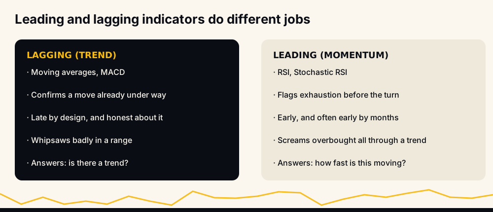
Moving averages and MACD are lagging: they confirm a move that has already started, and they are honest about it. RSI and Stochastic RSI are leading in the weak sense that they can flag exhaustion before price turns — and they can flag it many weeks before, or when no turn is coming at all.
Bollinger Bands sit outside the pair: they describe volatility, which is neither leading nor lagging about direction because it is not about direction.
The practical rule follows. Use a lagging tool to decide whether a trend exists, and a leading one to time an entry inside a trend already established. Reversing that order — using an oscillator to call the trend — is the commonest way beginners lose money with indicators, and one of the common mistakes in technical analysis worth reading separately.
Three momentum indicators are not three opinions
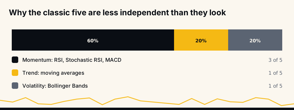
Sort the five by family and the redundancy is obvious. RSI, Stochastic RSI and MACD are all momentum measures, and two are nested: StochRSI is computed from RSI. When both say overbought, that is one observation reported twice, not two agreeing sources.
A chart carrying all three devotes three panes to a single question and shows nothing of volume, volatility regime or market structure. If you want a second opinion, take it from a different family.
The settings that matter, and the ones that do not
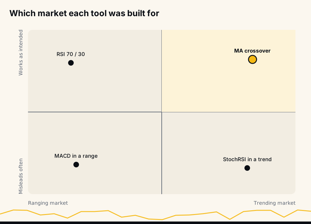
One setting matters more than the rest: the lookback period, because it defines the horizon the indicator describes. Match it to how long you actually hold. Everything else is usually noise-fitting.
The trap is optimisation. Testing 14 against 13 against 15 on historical data always finds one that performed best, and that winner describes the past. A parameter chosen because it topped a backtest by a small margin is the definition of a curve fit, and it rarely survives a new regime.
What indicators cannot see at all
Every one of the five is a function of past price. None of them can see a token unlock schedule, an exchange outage, a listing announcement, a protocol exploit, a funding rate at an extreme, or a large holder about to sell. The chart absorbs these things after the fact, which is why an indicator reading can be perfectly correct and completely useless in the same hour.
This is the honest limit of the discipline. Indicators describe participants who have already acted — a lens on the past with some predictive value in stable conditions and none at the moments conditions change, which are exactly the moments that determine most of a year's results.
It is why most traders also read the raw bars as candlestick patterns.
Where automation fits
Reading five indicators by hand across a few charts is manageable. Doing it across 500+ Binance USDT-M perpetual pairs, continuously, is not.
HafizeBot's calls are AI-generated signals, from a model that evaluates 240+ indicators, formulas and components across those pairs and rates each signal by strength. Which components it uses, and how it weighs them, is proprietary and stays that way; nothing on this page should be read as a description of it. What is public is the record: 33 monthly spreadsheet reports covering June 2021 to February 2024 and 33,694 signals, at a median monthly accuracy of 98.9% as reported in those sheets, downloadable from the reports archive. Since June 2026 the live performance page has been rebuilt hourly from the trade database, counting expirations against the hit rate so losing months appear when they happen. The origins of the project explain why it was built that way round.
To watch before committing anything, the free channel at t.me/getbinancefutures carries the calls of strength 3 and up on a twenty-minute delay, with around 3,980 members as of August 2026.
None of this is investment advice. Indicators describe risk; they do not remove it — trade only what you can afford to lose, and assume the next signal is one of the ones that does not work.
FAQ
What are technical analysis indicators? They are arithmetic transformations of past price and volume, drawn on or under a chart to compress information a trader cannot weigh by eye. They fall into families — trend, momentum, volatility, volume — and each answers one question well and the others poorly.
What are the top 5 technical analysis indicators? The Relative Strength Index, moving averages, MACD, Stochastic RSI and Bollinger Bands are the five that appear on almost every platform by default. That popularity reflects age and availability rather than superiority; three of the five measure momentum, so the set is less diversified than it looks.
What is the best technical analysis indicator? There is no best one, because they answer different questions. Ask which family your decision needs: a trend tool for direction, a momentum tool to time an entry within it, a volatility tool to size the position. One indicator per family beats three from the same family.
How many technical analysis indicators are there? Hundreds are published and platforms ship dozens by default, but the count misleads. Most are variations on a handful of underlying calculations, and adding more from one family multiplies screen space without adding information.
Are leading indicators better than lagging indicators? Neither is better; they fail differently. Lagging indicators confirm late and whipsaw in ranges. Leading indicators warn early and give false alarms throughout strong trends. Use a lagging tool to establish trend and a leading one to time entries inside it.
Do technical indicators work in crypto? The formulas apply to any price series, but two things change. Crypto trades continuously, so the "daily close" every daily indicator depends on is an arbitrary hour, and volatility is high enough that oscillators saturate at their extremes far more often than in equities.