Support is a price area where buying has repeatedly been strong enough to stop a decline; resistance is where selling has repeatedly been strong enough to stop a rally. Neither is a magic price. Both are simply places where a lot of orders have piled up, which is why price slows down there — and why a level that breaks so often turns into the opposite kind of level.
How support and resistance levels actually form
A level is not drawn by the market; it is drawn by the people who traded there and are still thinking about it.
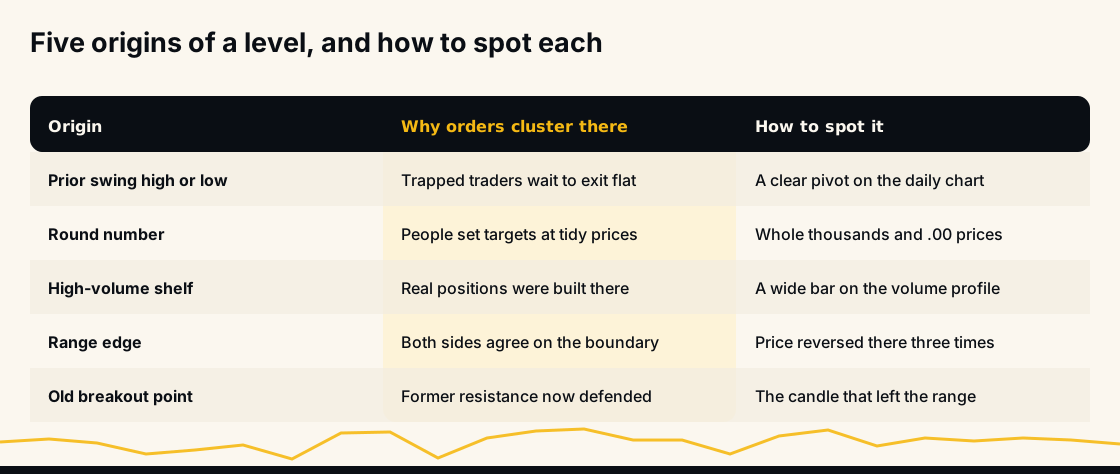
Three groups create the cluster of orders at any old price. Traders who bought there and are now underwater want out at break-even, so they sell into the return — that is resistance. Traders who sold there and watched price run want a second entry at the same price, so they buy the return — that is support. And traders who missed the move entirely leave resting orders where they wish they had acted.
Add algorithmic participants that place limit orders around obvious historical pivots, and the price becomes genuinely different from its neighbours: there is more resting size there. That is the whole mechanism. Support and resistance work because order books are not uniform.
Why round numbers act as levels
Humans place orders at tidy prices. Bitcoin at $100,000, Ether at $4,000, a mid-cap at $1.00 — those attract far more resting orders than $99,873 does, purely because people think in round terms when they set targets and stops.
In crypto this is amplified by exchange interfaces that suggest round increments and by the fact that the same headline numbers are quoted everywhere. Round numbers are self-fulfilling levels: they matter because everyone expects them to, and expectation is what puts the orders there.
The practical consequence is that a psychological level and a technical level stacked at the same price — a prior swing high that also happens to be a round number — is much stronger than either alone. Traders call that confluence, and it is the single most useful filter for deciding which levels to bother marking.
Why a broken level flips roles
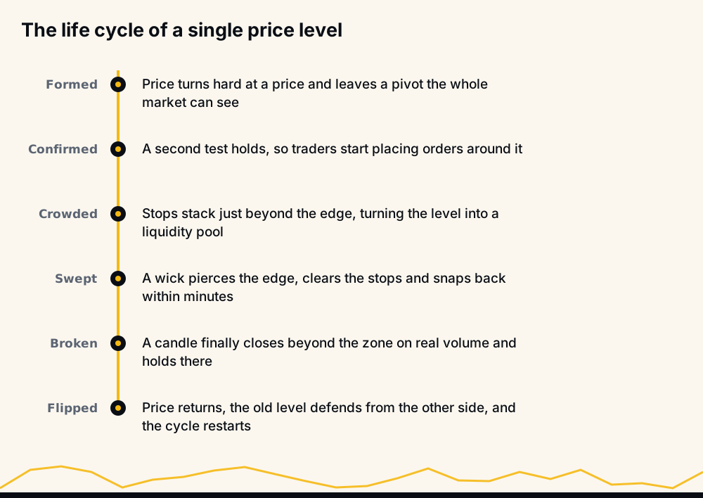
The most useful property of a level is that it changes sides. Resistance that breaks tends to become support; support that breaks tends to become resistance.
The reason is the same order clustering, seen after the fact. When price finally breaks above a ceiling, everyone who sold there is now wrong, and many will buy back if price returns to their entry. The buyers who broke it are keen to add on a pullback. So the price that was defended from above is now defended from below by a fresh set of participants.
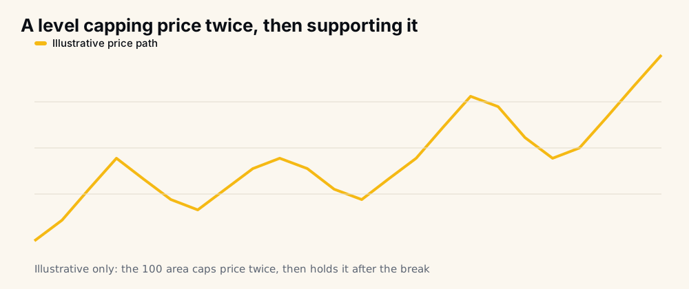
That retest is one of the more tradeable events in technical analysis, because the invalidation is obvious: if the old level does not hold on the way back, the break was not real. What makes it hard is that the retest is not guaranteed to happen, and waiting for one that never arrives means missing the move entirely.
Draw zones, not lines
The single biggest upgrade to most people's charts is to stop drawing hairlines. Price does not respect a one-pixel value; it respects an area.
A zone is bounded by the bodies of the candles that reversed at one edge and the wicks at the other. Everything between is contested ground. On a volatile perpetual, a sensible zone on a daily chart might be half a percent to two percent wide.
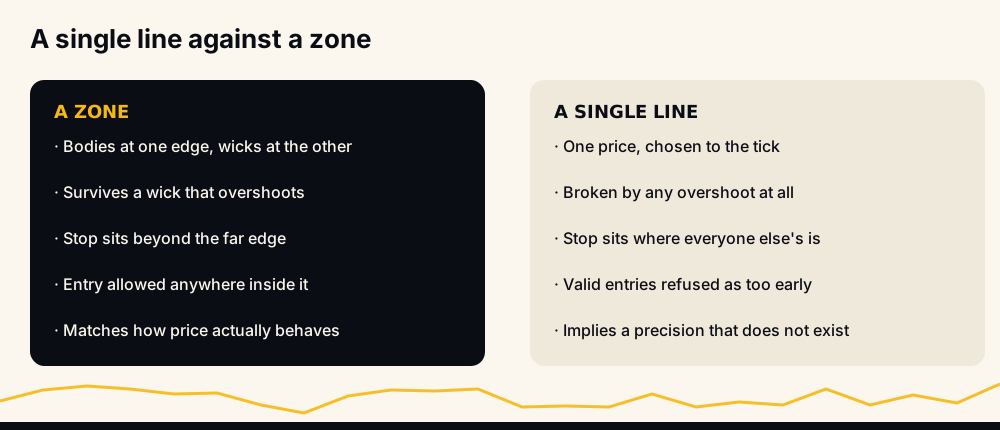
Drawing lines creates two specific failures. You get stopped out by a wick that pierced your line by a fraction and reversed, and you refuse valid entries because price turned "two ticks early". Both are artefacts of pretending a level is precise when it is not.
How to find support and resistance on a crypto chart
The process is mechanical and takes about five minutes per pair.
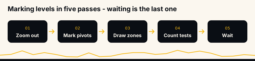
- Zoom out first. Start on the weekly or daily chart. Levels visible on a high timeframe matter to more people, which is exactly what makes them matter at all.
- Mark obvious pivots. Where did price clearly turn, more than once? Ignore every wiggle you have to squint at.
- Convert each pivot to a zone. Bodies at one edge, wicks at the other.
- Count the touches and the reactions. How many times was it tested, and how hard did price bounce?
- Then wait. A level is only useful when price comes back to it. Chasing price in the middle of the range is how good analysis becomes bad trading.
Keep the chart clean. Five levels you understand beat twenty you drew because you could.
What makes one level stronger than another
Not all levels are equal, and the difference is measurable by eye:
- Timeframe. A weekly level outranks a 15-minute one, every time.
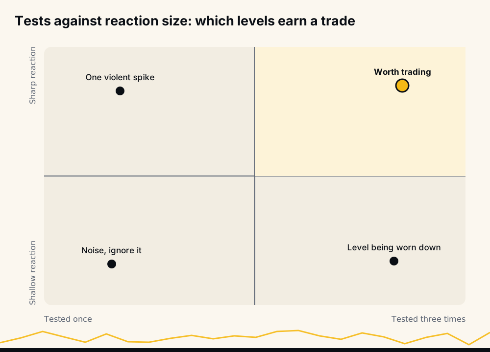
- Number of touches. Two or three reactions confirm the level exists. Beyond four or five, each additional test tends to weaken it — the resting orders get consumed.
- Size of the reaction. A level that produced a 12% bounce is a different animal from one that produced 1%.
- Volume at the level. Heavy traded volume in that area means real positions were built there.
- Recency. A level from three weeks ago is more relevant than one from 2021, though major highs and lows age well.
- Confluence. A prior high that is also a round number and a moving average is worth three ordinary levels.
Dynamic levels: moving averages, trendlines and Fibonacci
Horizontal zones are the backbone, but three tools produce levels that move with price.
Moving averages act as sliding support in an uptrend and sliding resistance in a downtrend. The 50 and 200-period averages are watched by enough people to become self-fulfilling in the same way round numbers do.
Trendlines connect successive higher lows or lower highs. They are more subjective than horizontal levels — two analysts will draw the same trend differently — so treat a trendline break as weaker evidence than a horizontal break.
Fibonacci retracements mark the 38.2%, 50% and 61.8% pullback depths of a prior swing. There is no law of nature behind those percentages, but they are drawn on so many screens that orders collect at them anyway. Bands built around volatility, such as Bollinger Bands, do a similar job for stretched moves.
Every one of these is a level in the same sense as a horizontal zone: a place where orders concentrate. None of them is a reason to trade on its own.
Stop hunts: how levels get swept in leveraged crypto
Here is the part most beginner guides leave out. In leveraged crypto markets, obvious levels are also obvious pools of stop-loss orders — and stop orders are liquidity that large participants want to trade against.
The pattern is familiar to anyone who has traded perpetuals: price dips sharply below an obvious support, triggers a cascade of stops and liquidations, and reverses within minutes, leaving a long wick and a chart that looks exactly like the level held.
Three defences, none perfect:
- Place stops beyond the zone, not on its edge. The edge is where everyone else's stop is.
- Wait for a close, not a touch. A wick through a level is not a break; a candle closing beyond it and holding is the beginning of one. Reversal shapes at the level, covered in our guide to 12 candlestick patterns in technical analysis, are what confirm a hold.
- Use smaller size with a wider stop rather than large size with a tight one. The arithmetic below explains why.
Where the stop goes, and what that does to position size
Zone width is not a cosmetic choice; it decides your position size. Suppose a $5,000 account risking 1% — $50 — per trade. Position size is risk divided by stop distance.
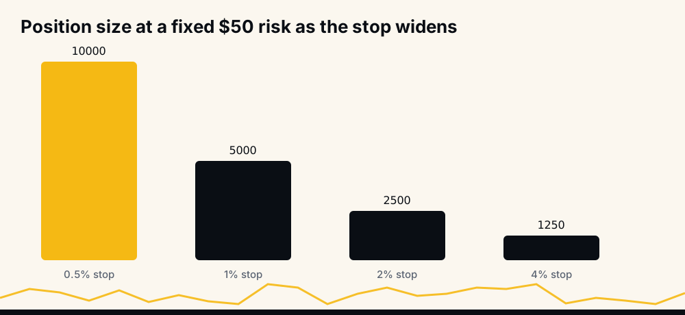
A 0.5% stop supports a $10,000 position; a 4% stop supports $1,250. Same risk, eight times the exposure. This is why traders are tempted to place stops right under the level — and why they get swept out of trades that would otherwise have worked.
The honest resolution is to accept the wider stop, take the smaller position, and require a bigger target to justify the trade.
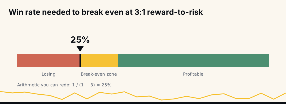
At 3:1 reward-to-risk, one win pays for three losses, so break-even is 1 ÷ (1 + 3) = 25%. Levels are useful precisely because they let you define a tight, logical invalidation point and therefore reach for those ratios — but only if you are honest about where the level actually ends.
Trading a level: the bounce and the break
Two setups, two entirely different risk profiles.
The bounce. Price enters the zone, shows rejection, and you enter with a stop beyond the far edge. Best when the trend is intact and the level is being tested for the second or third time — not the sixth.
The break. Price closes decisively through the zone on rising volume. The lower-risk version is not the breakout candle itself but the retest afterwards, when the old resistance is defended as support.
Volume separates the two. A break on thin volume, especially in dead hours, is the most common false signal in crypto. A break with visible participation is far more likely to hold — which matters more on perpetuals than on the spot market, where leverage does not amplify every failed attempt.
The mistakes that make levels look useless
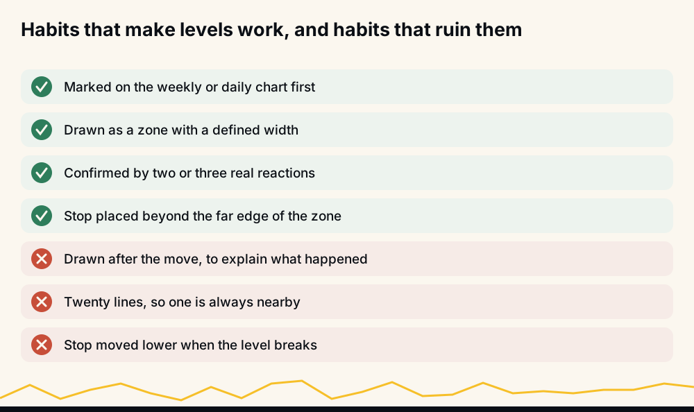
- Drawing after the fact. Levels are trivially easy to fit to a chart you have already seen. Mark them before, not after.
- Too many lines. Twenty levels means one is always nearby, which means the chart says nothing.
- Treating a level as a prediction. It is a decision point with a defined invalidation, not a forecast.
- Ignoring the trend. Buying support in a steady downtrend catches every knife on the way down. Levels are filters, not reversal guarantees.
- Refusing to be wrong. If the level breaks and holds beyond, the analysis was wrong. Moving the stop lower is not patience.
Where automated signals fit alongside level analysis
Marking levels is judgement work, and judgement gets worse the longer you stare at a screen. A market that never closes and runs to hundreds of pairs simply outlasts human attention.
HafizeBot publishes AI-generated signals from a model that evaluates 240+ indicators, formulas and components across 500+ Binance USDT-M perpetual pairs, rating each call by strength. The historical record is 33 monthly spreadsheet reports covering June 2021 to February 2024 and 33,694 signals, with median monthly accuracy of 98.9% as reported in those spreadsheets — downloadable at /reports.
Since June 2026 the live performance page has been regenerated hourly from the trade database: a win is a target hit, and the page shows Wins, Missed and Open. Broadcast signals carry a target and a maximum hold, not a stop, so every signal that does not reach its target in time counts as Missed and lowers the rate. Losing months show up there when they happen. The stronger calls, strength 3 and up, reach the free channel t.me/getbinancefutures on a 20-minute delay, so you can compare them against your own levels before committing anything.
None of this is investment advice, and you should only trade what you can afford to lose. Levels tell you where a decision belongs and where you are wrong — they do not remove the risk of being wrong.
Frequently asked questions
How do you find support and resistance levels? Start on the weekly or daily chart, mark the prices where the market clearly turned more than once, then widen each into a zone using candle bodies at one edge and wicks at the other. Keep only the levels that produced a visible reaction.
Why does support become resistance when it breaks? Because the people who bought at that price are now underwater and sell into any return to break-even, while the sellers who broke the level want to add on a pullback. The order cluster survives the break; only its direction changes.
Are support and resistance the same as supply and demand zones? They describe the same phenomenon with different emphasis. Supply and demand language focuses on the origin candle of a big move, while support and resistance focuses on prices that repeatedly held. In practice the zones overlap heavily.
How many times can a level be tested before it breaks? There is no fixed number, but the tendency runs the opposite way to intuition: each successive test consumes resting orders, so a fifth or sixth test is generally weaker than the second. Repeated tests with shrinking bounces usually precede a break.
Do support and resistance work in crypto's 24/7 market? Yes, and arguably more visibly, because the same levels are watched globally with no session breaks to reset them. The complication is leverage: wicks through obvious levels are common, so wait for a candle to close beyond a zone before calling it broken.
The bottom line
Support and resistance is not a prediction tool. It is a map of where orders have piled up, drawn as zones rather than lines, ranked by timeframe, touches and reaction size. Use levels to decide where a trade begins and where it is proven wrong, respect the fact that wicks hunt the obvious ones, and size positions so a swept stop is an inconvenience rather than an event.